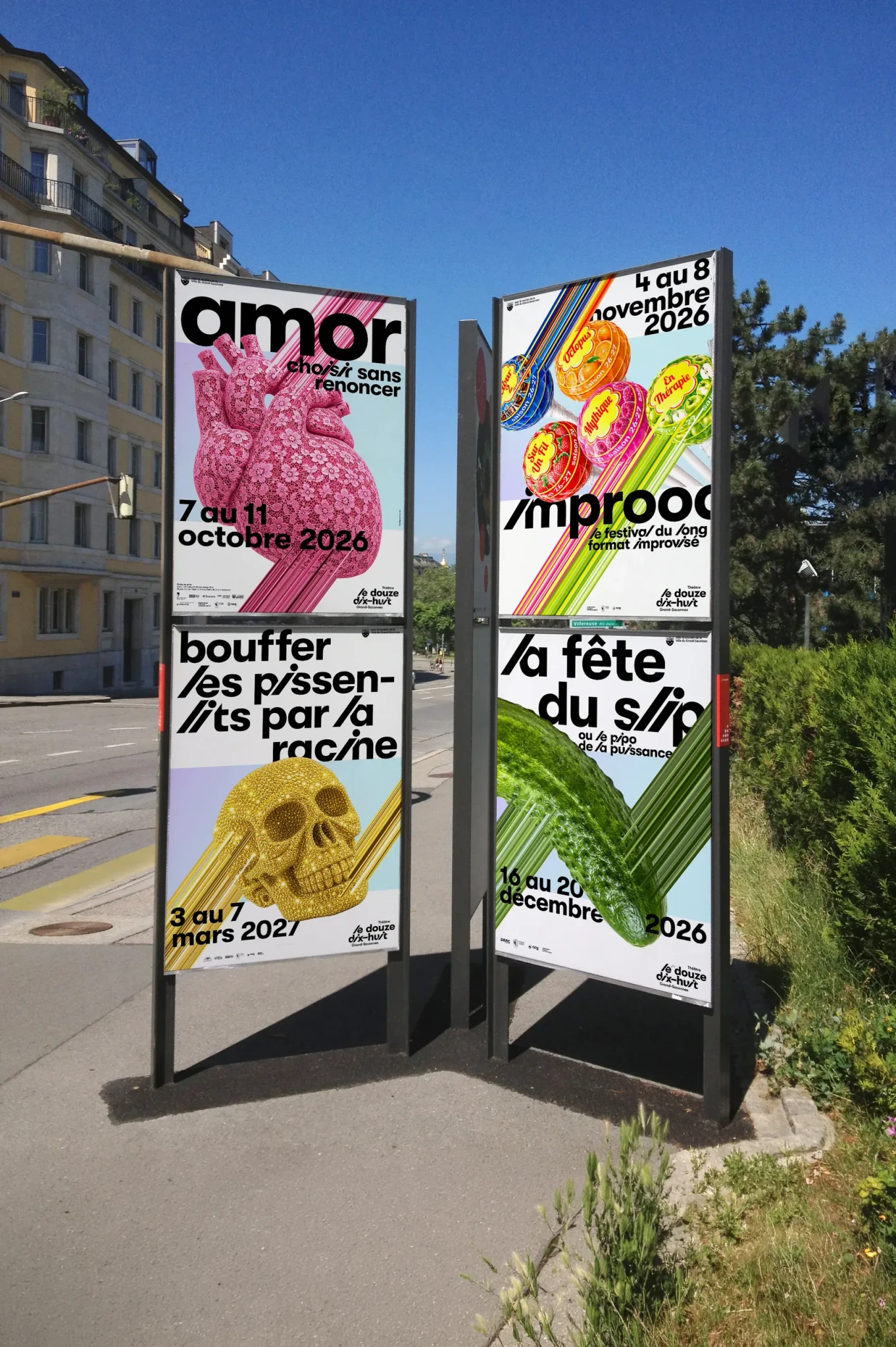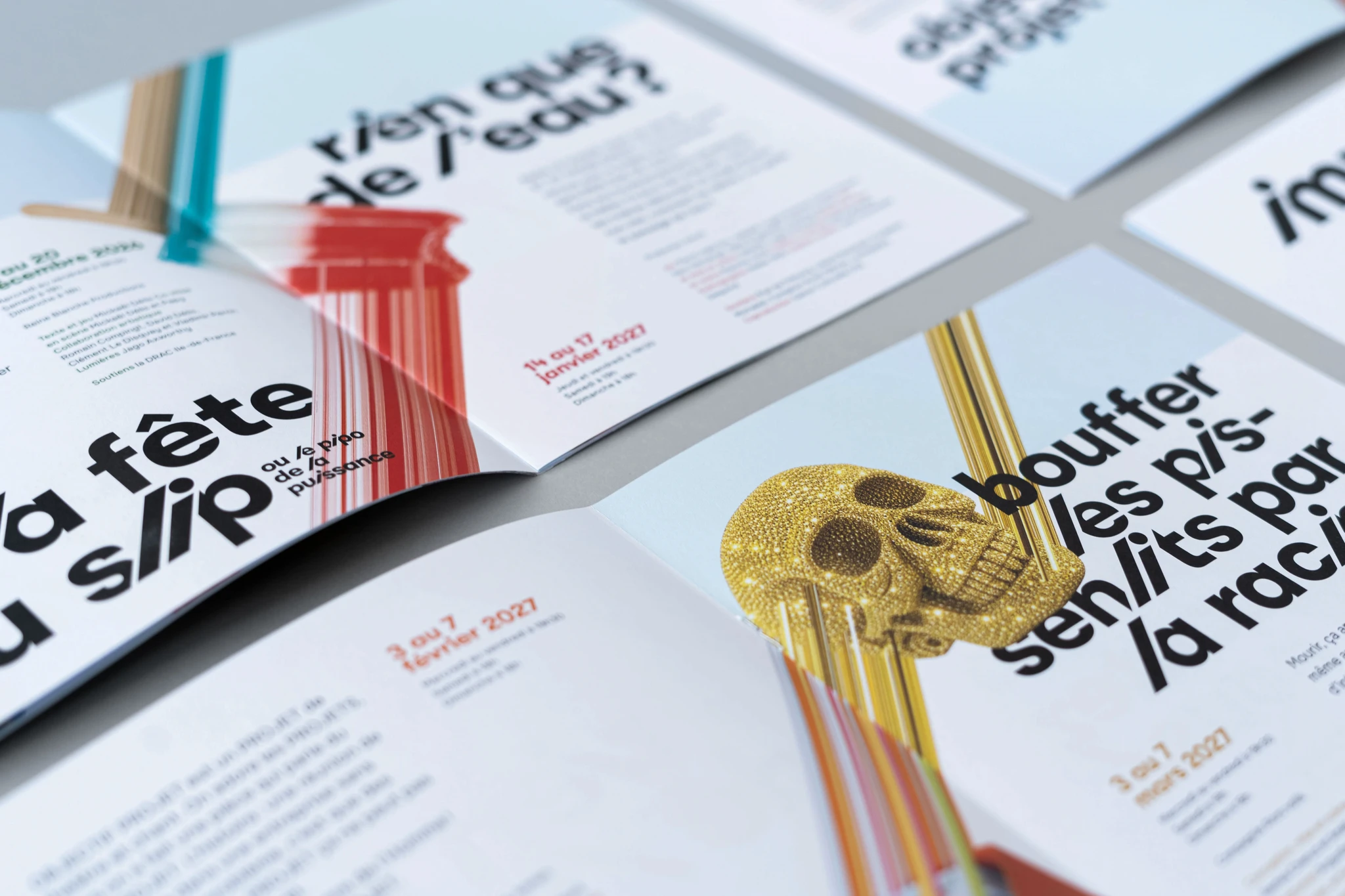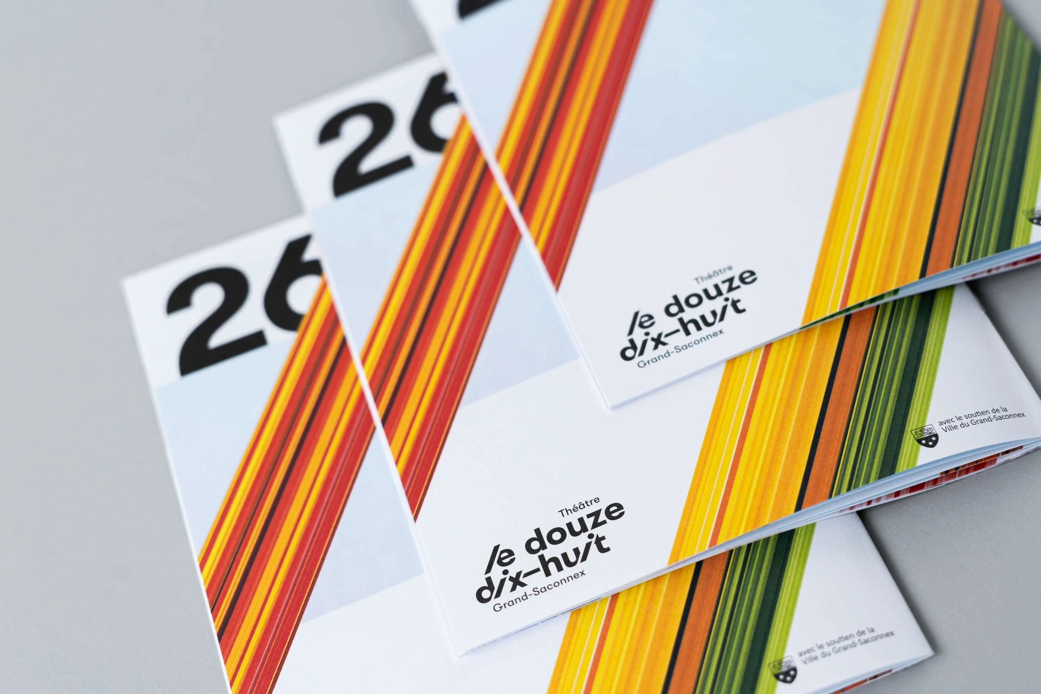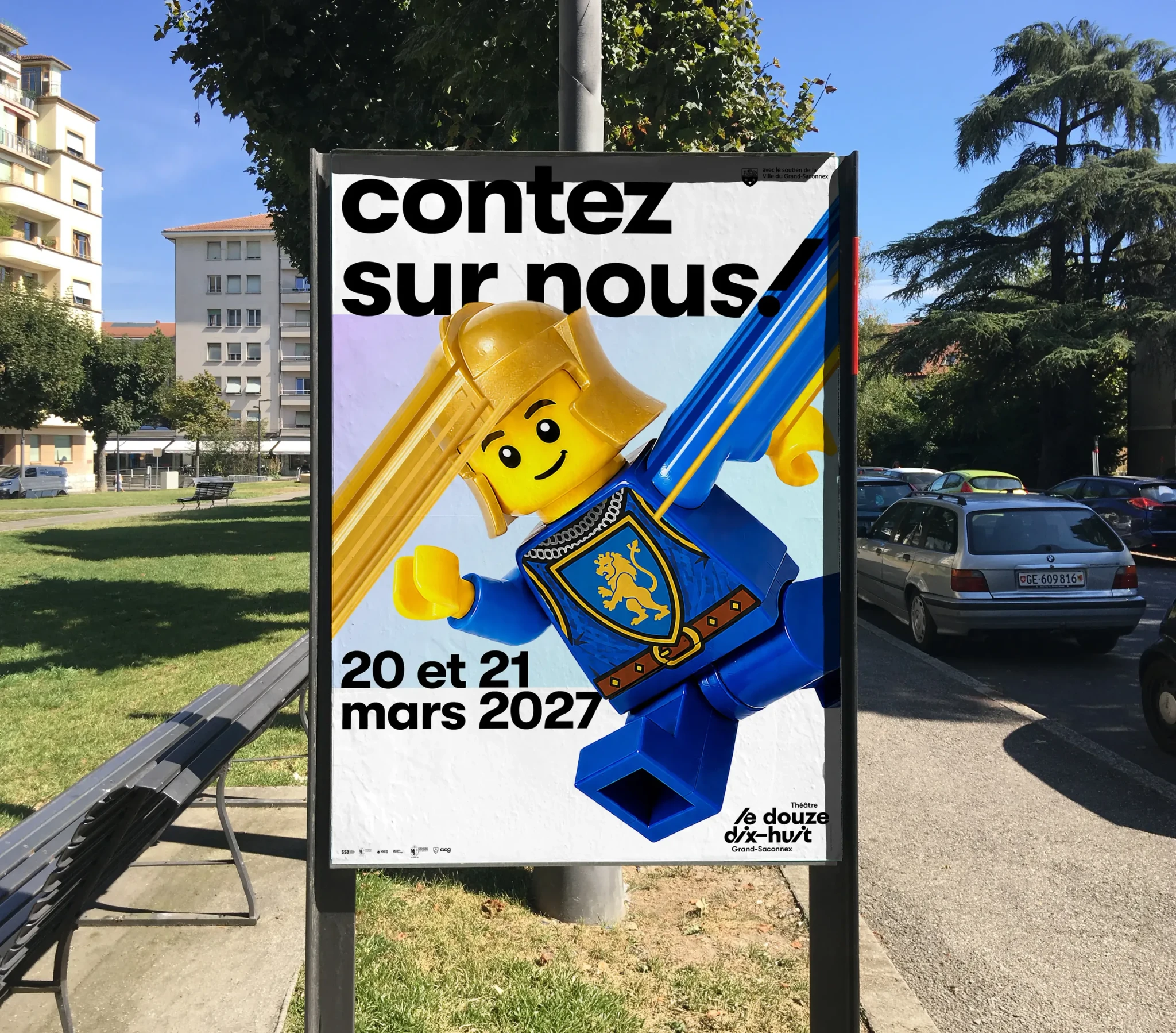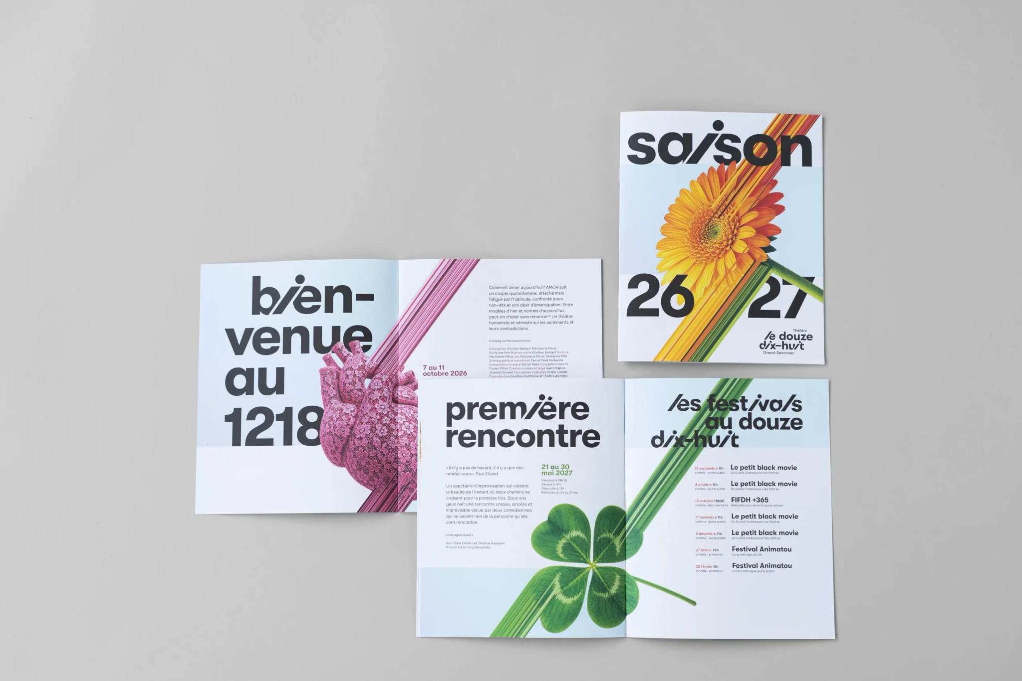
The Théâtre Le Douze Dix-Huit wanted to develop a new visual identity to strengthen its communications and raise its visibility, which had often been overshadowed by the visuals of the companies performing there. The challenge was to convey the venue’s accessible, vibrant character and its openness to all audiences.
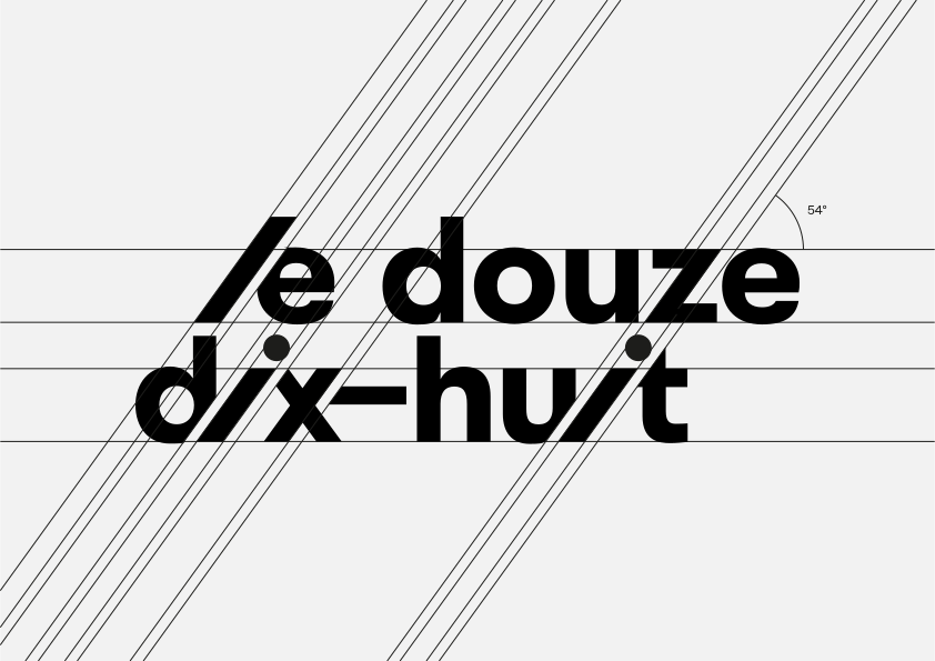
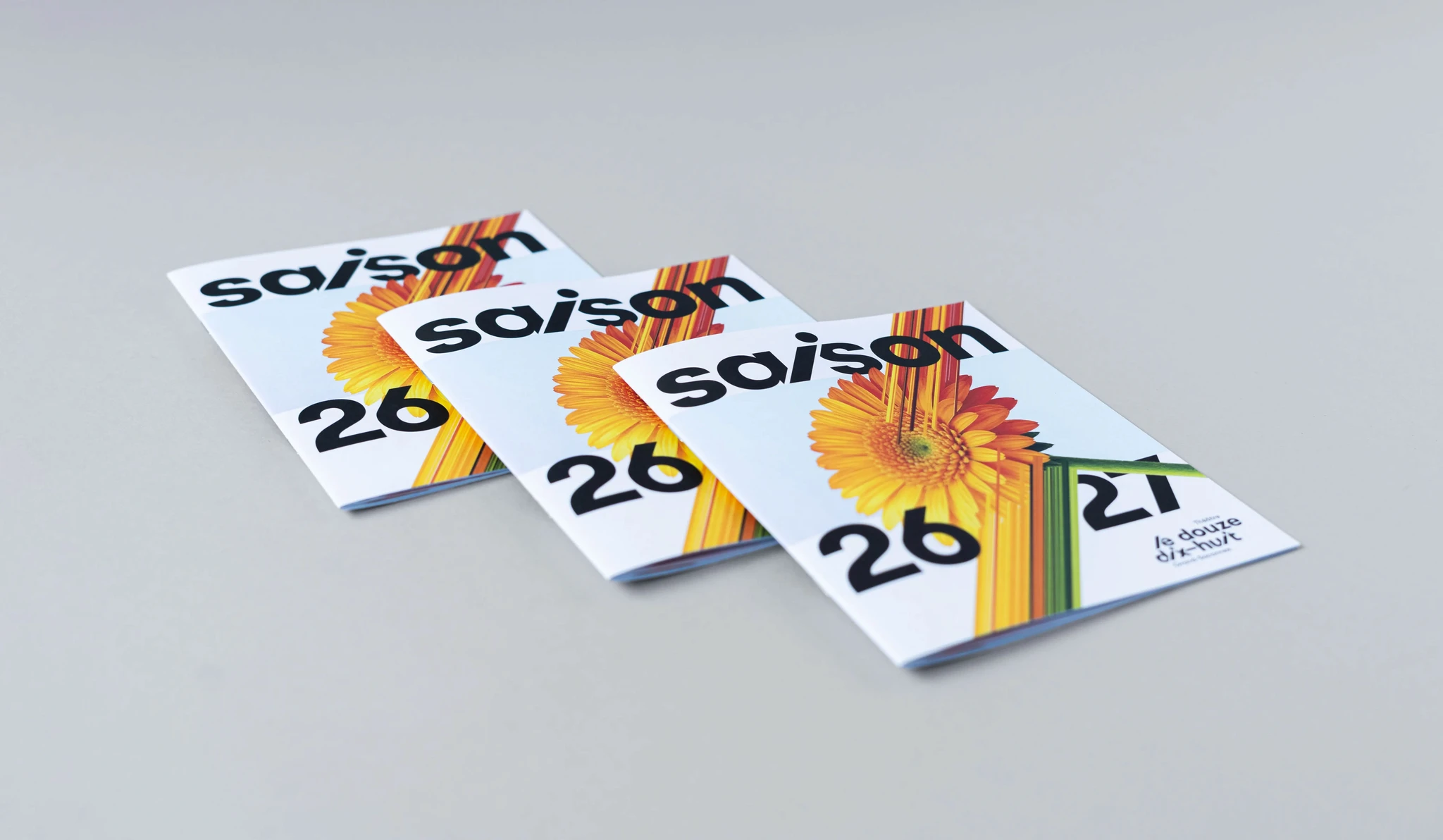
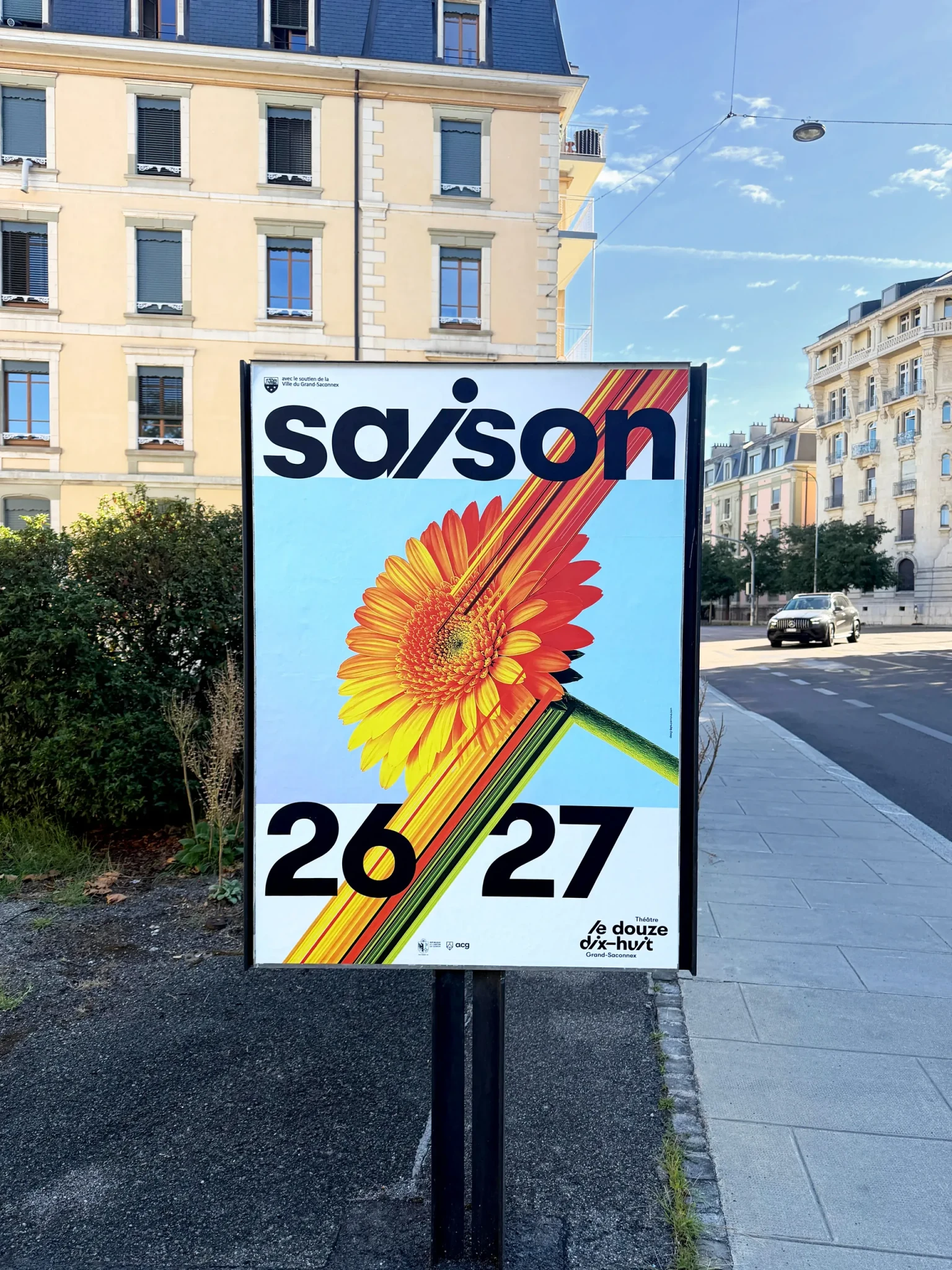
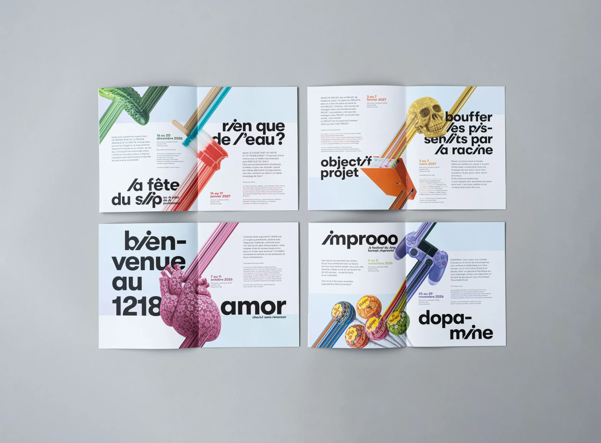
We designed a dynamic identity centered around an expressive typography, punctuated by the letters “i” and “l.” For the posters, we developed a simple and recognizable system: each performance is associated with an iconic object, chosen to echo the play, and crisscrossed by diagonally stretched bands of pixels. This symbolizes the exchange, connection, and emotional fragments that the audience member takes away with them. It is a strong, modular, and instantly recognizable graphic principle that also references the diagonal line found in the theater’s resident company logo, LesArts.