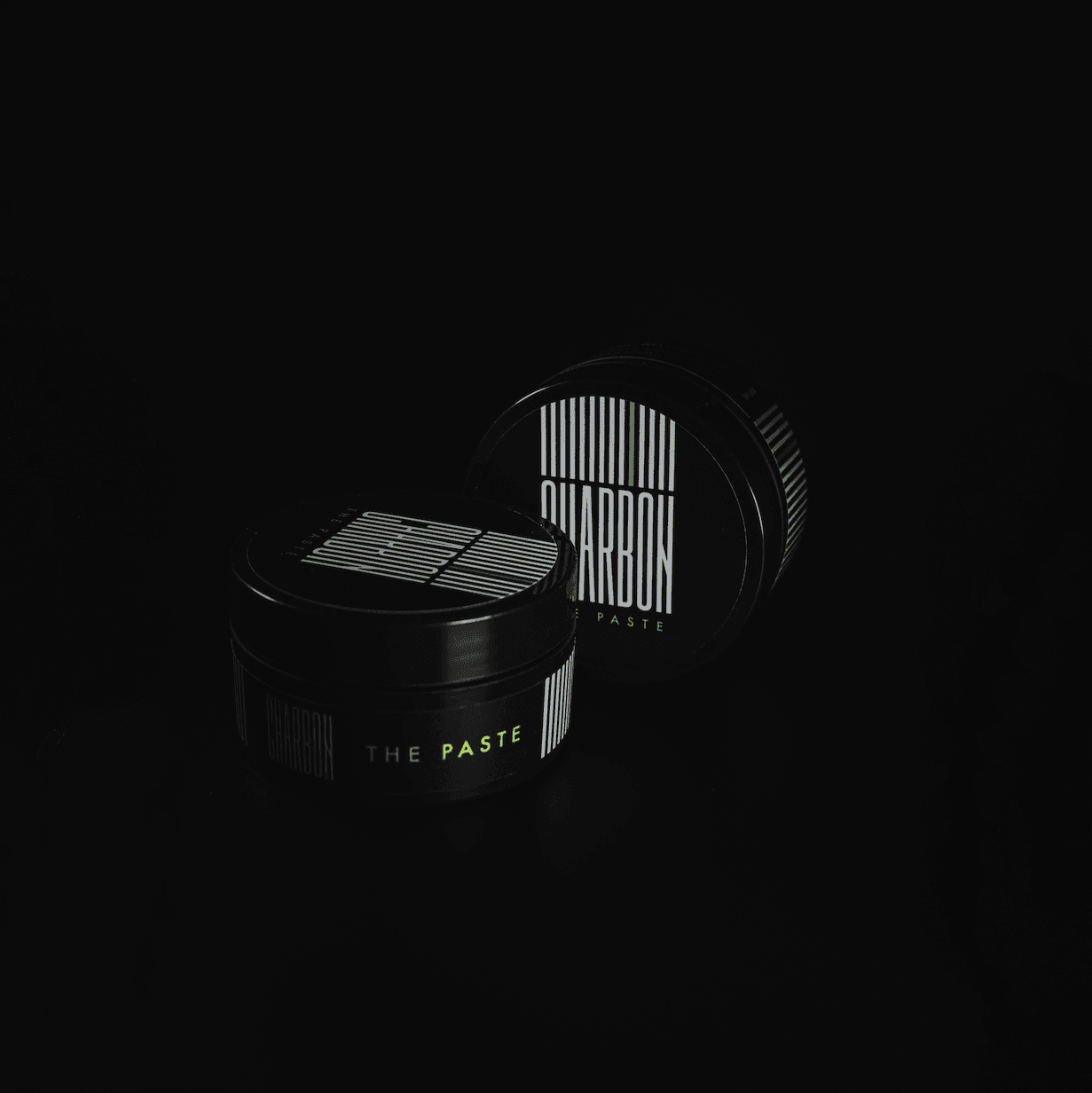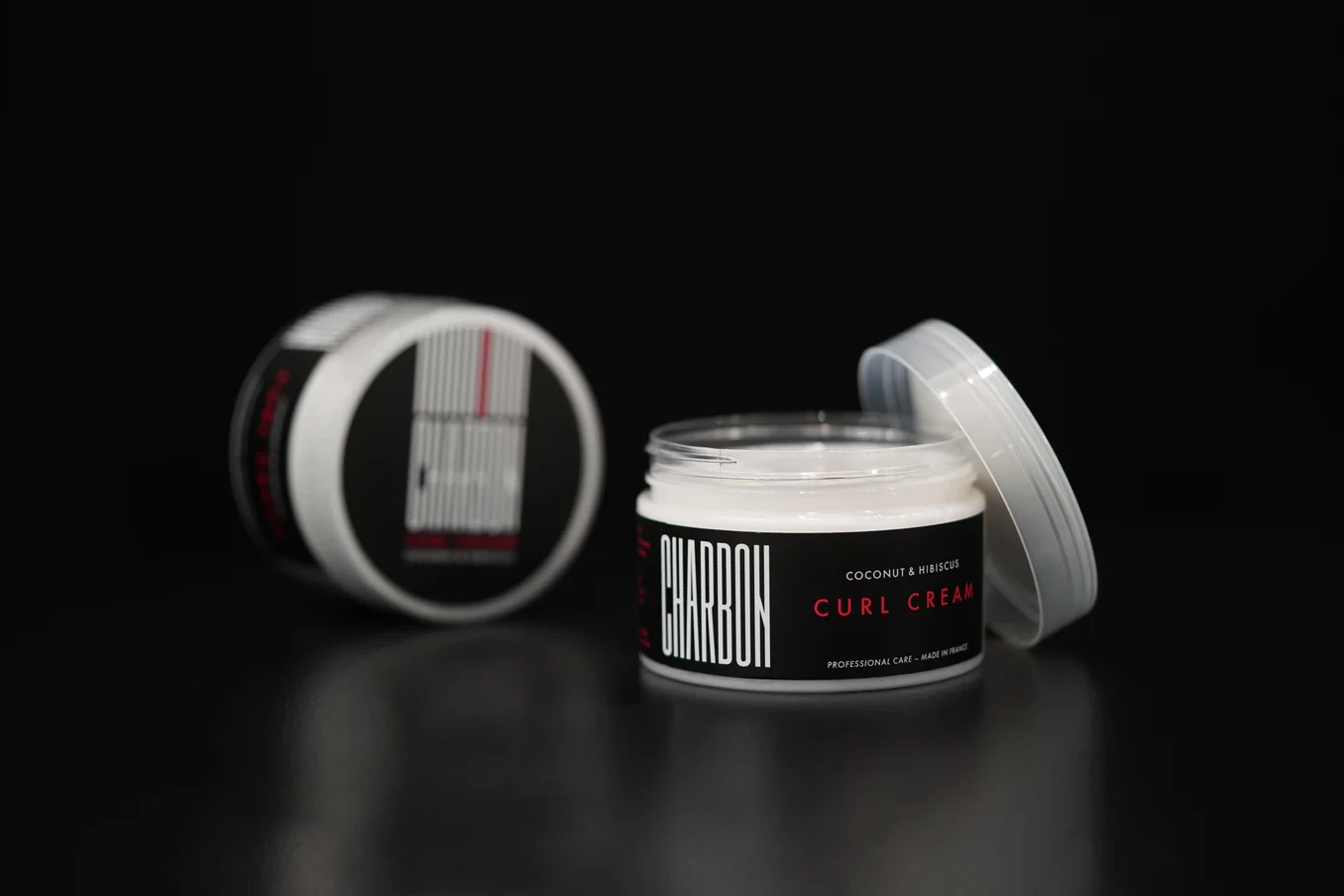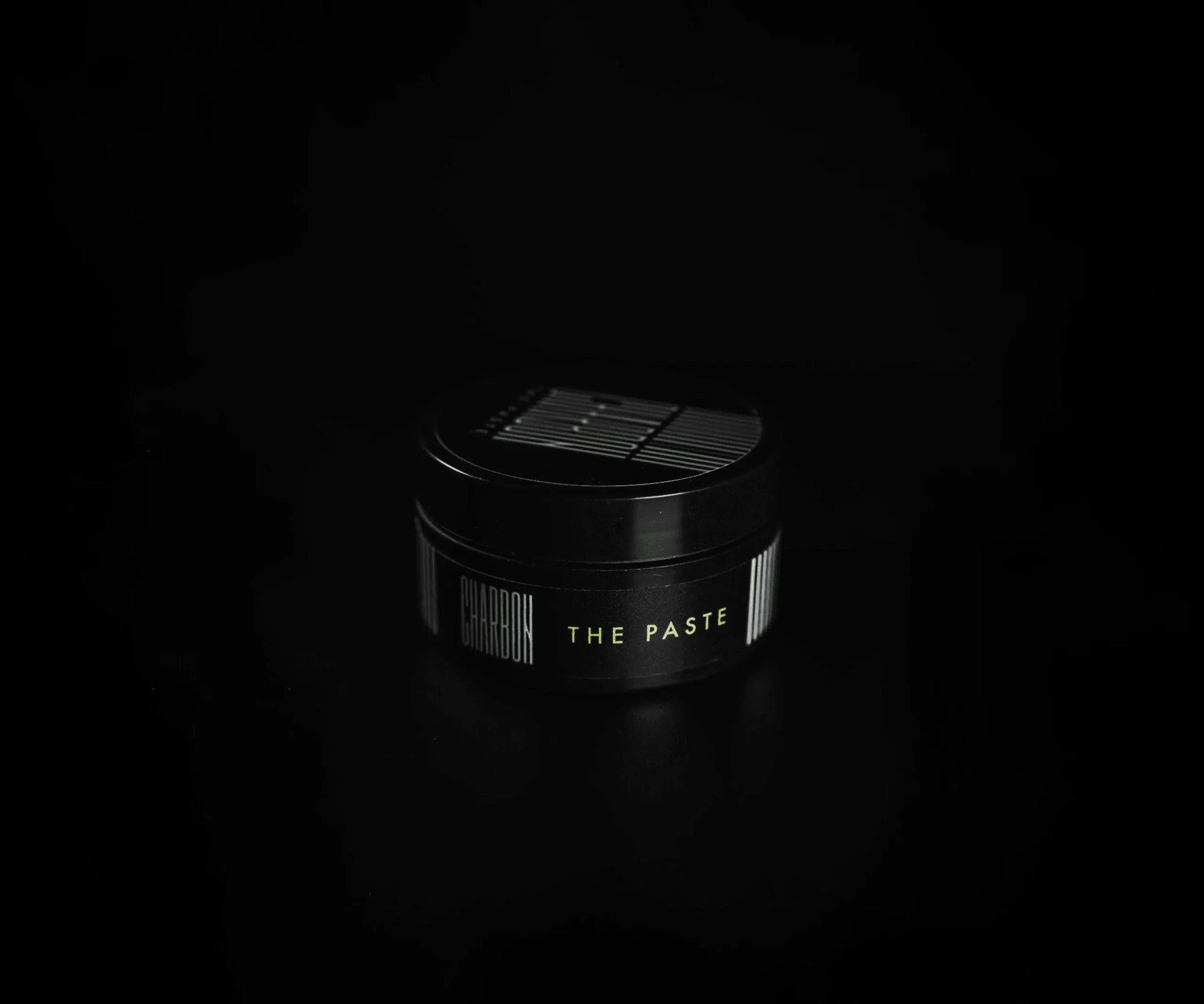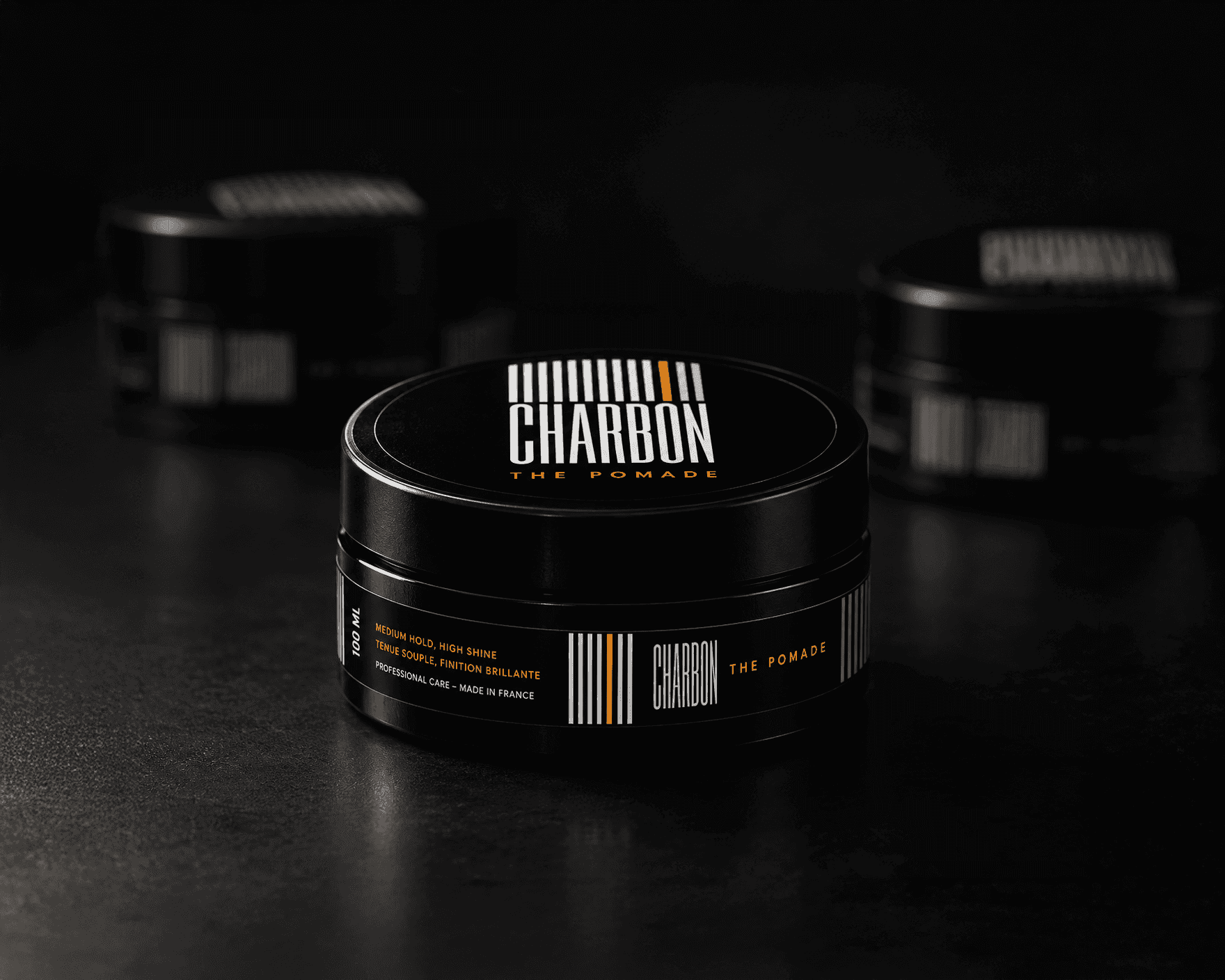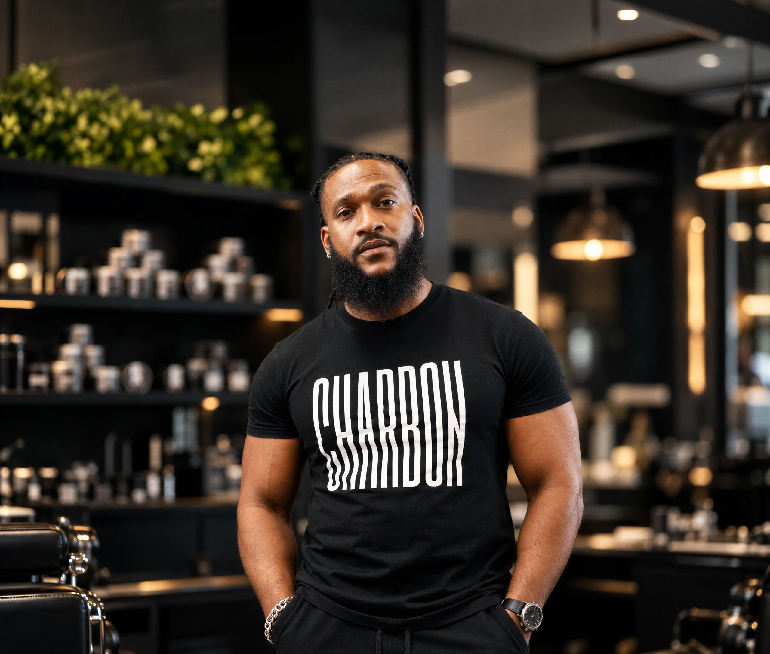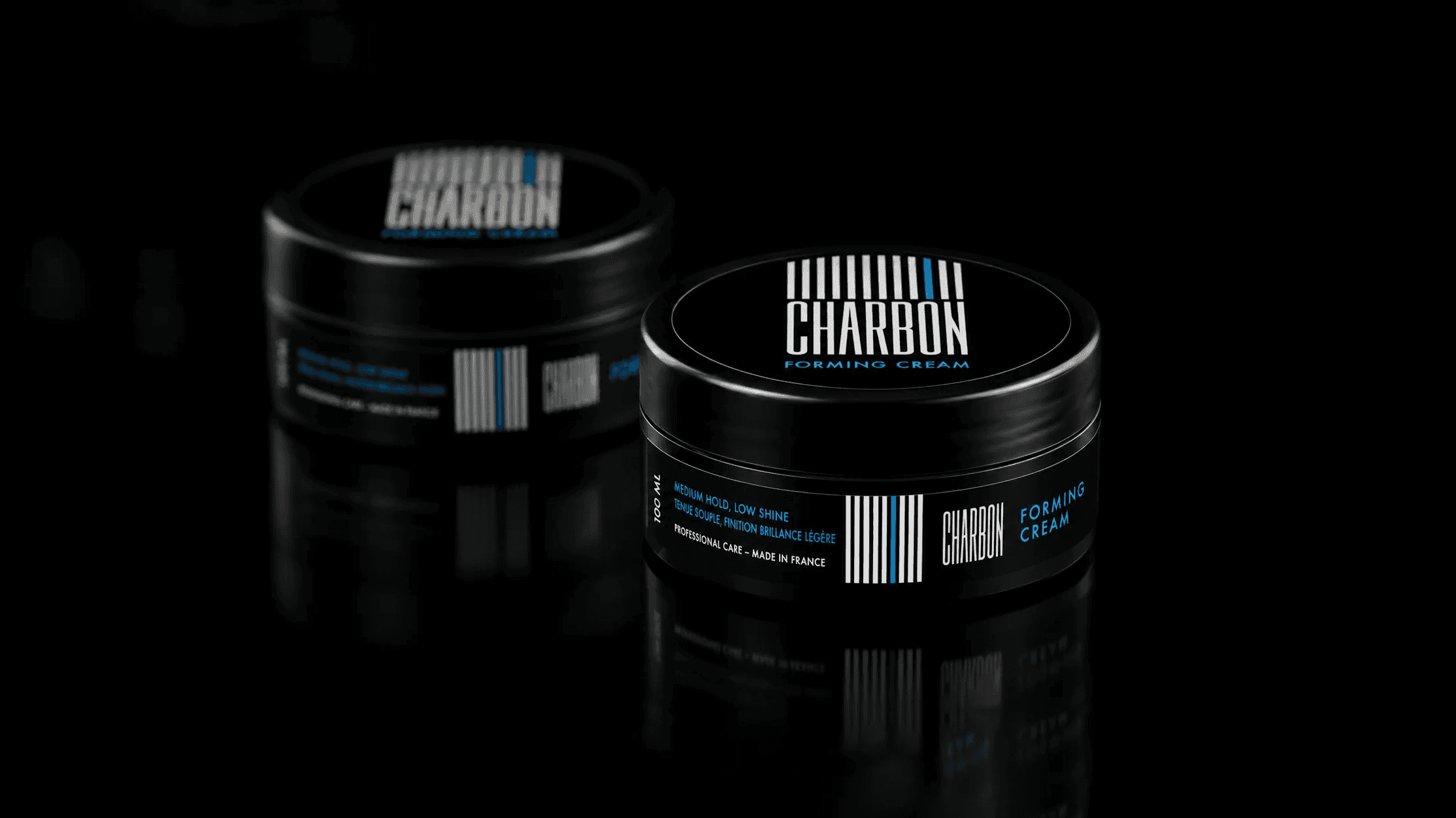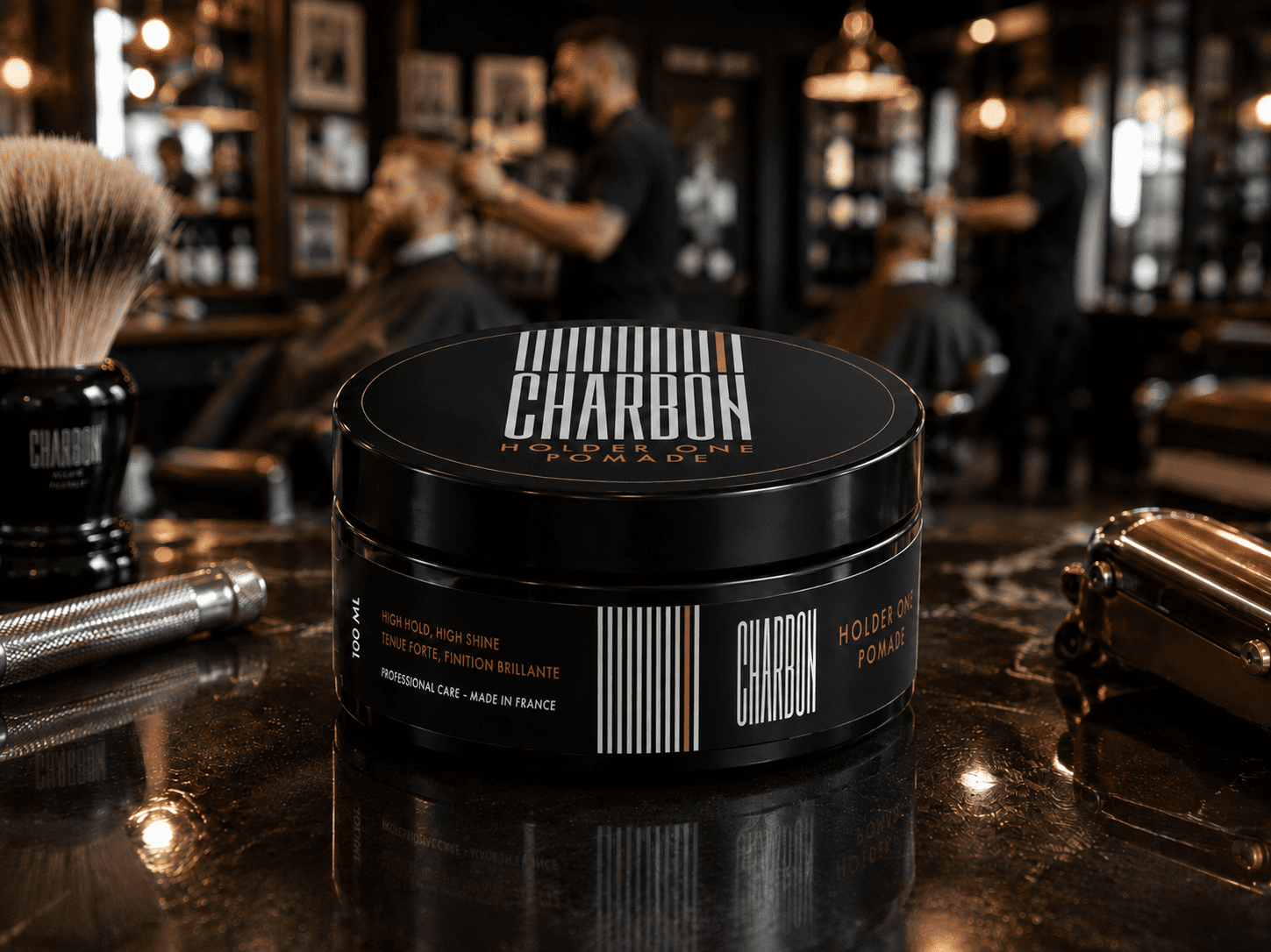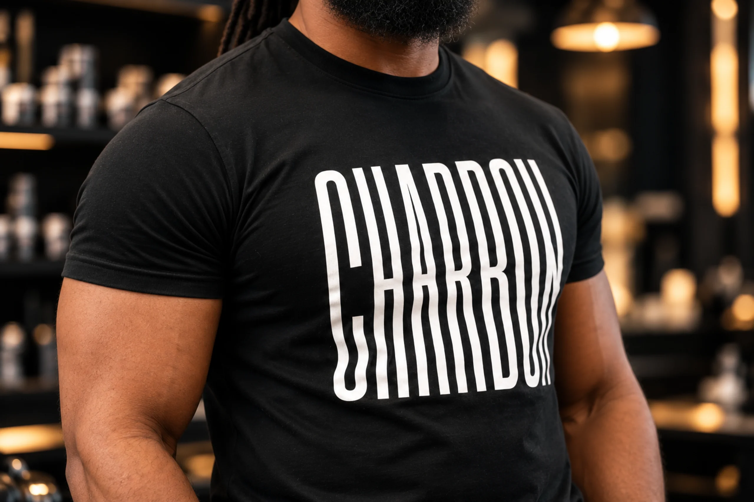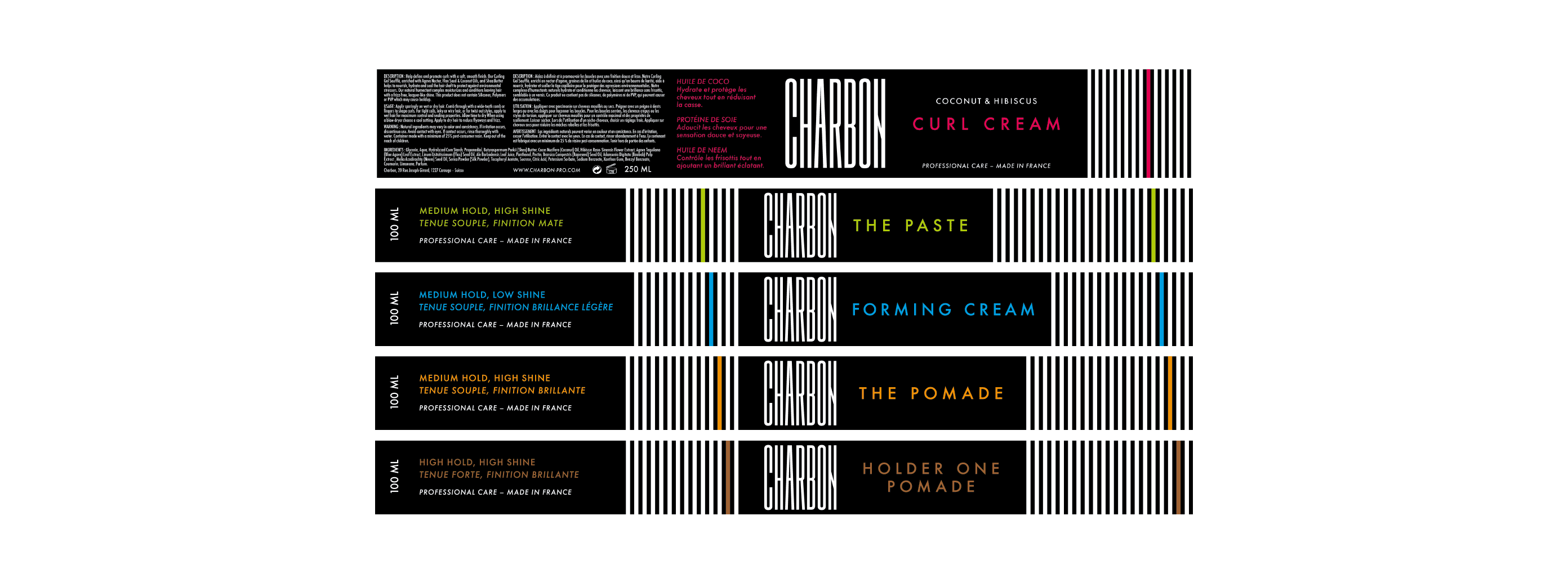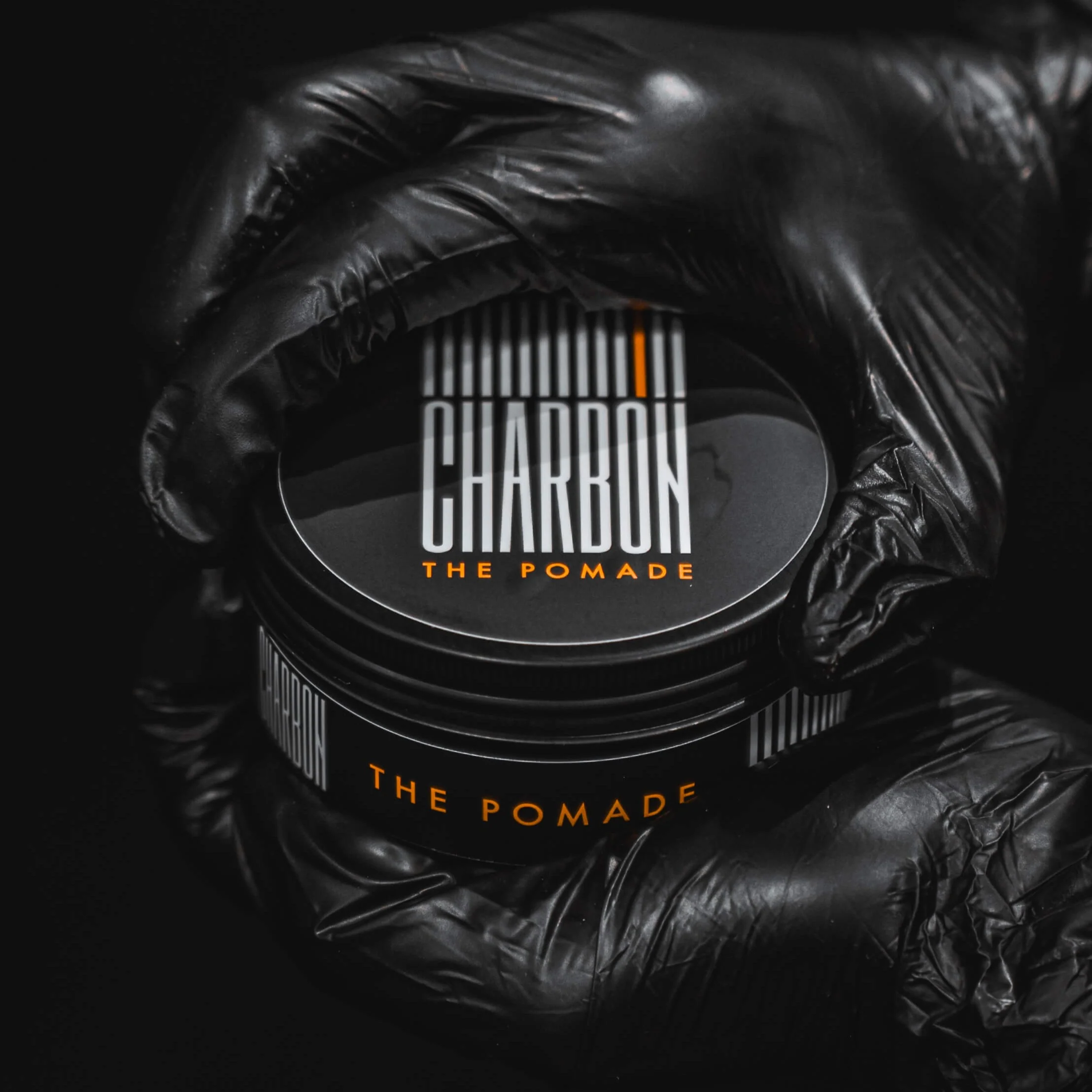
The barber chain “Barber Concept” wanted to develop its own range of men’s hair care products. We developed the brand universe for CHARBON and created packaging that is understated, distinctive and easily adaptable across the entire product range. The challenge was to create a visual system that could clearly differentiate each product while establishing a strong and consistent brand identity.
We designed a packaging identity built around deep black, elongated typography and graphic lines inspired by the teeth of combs and barber clippers. Each product is assigned a dominant colour, making its purpose easy to identify while maintaining consistency across the range. The result is a minimalist, precise and masculine visual language, designed to strengthen the product’s impact both in the hand and on the shelf.