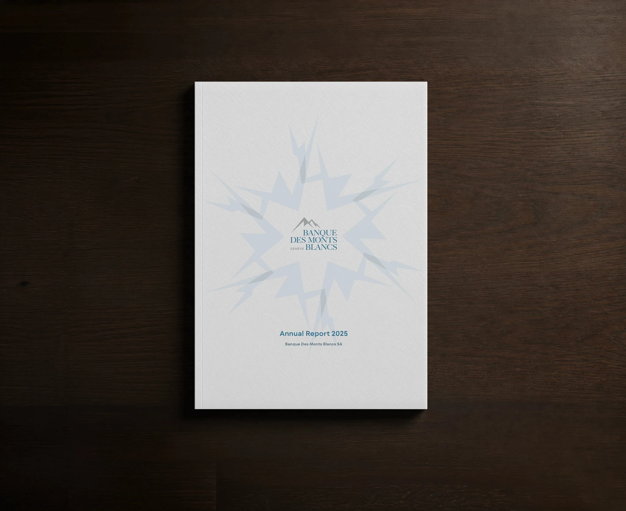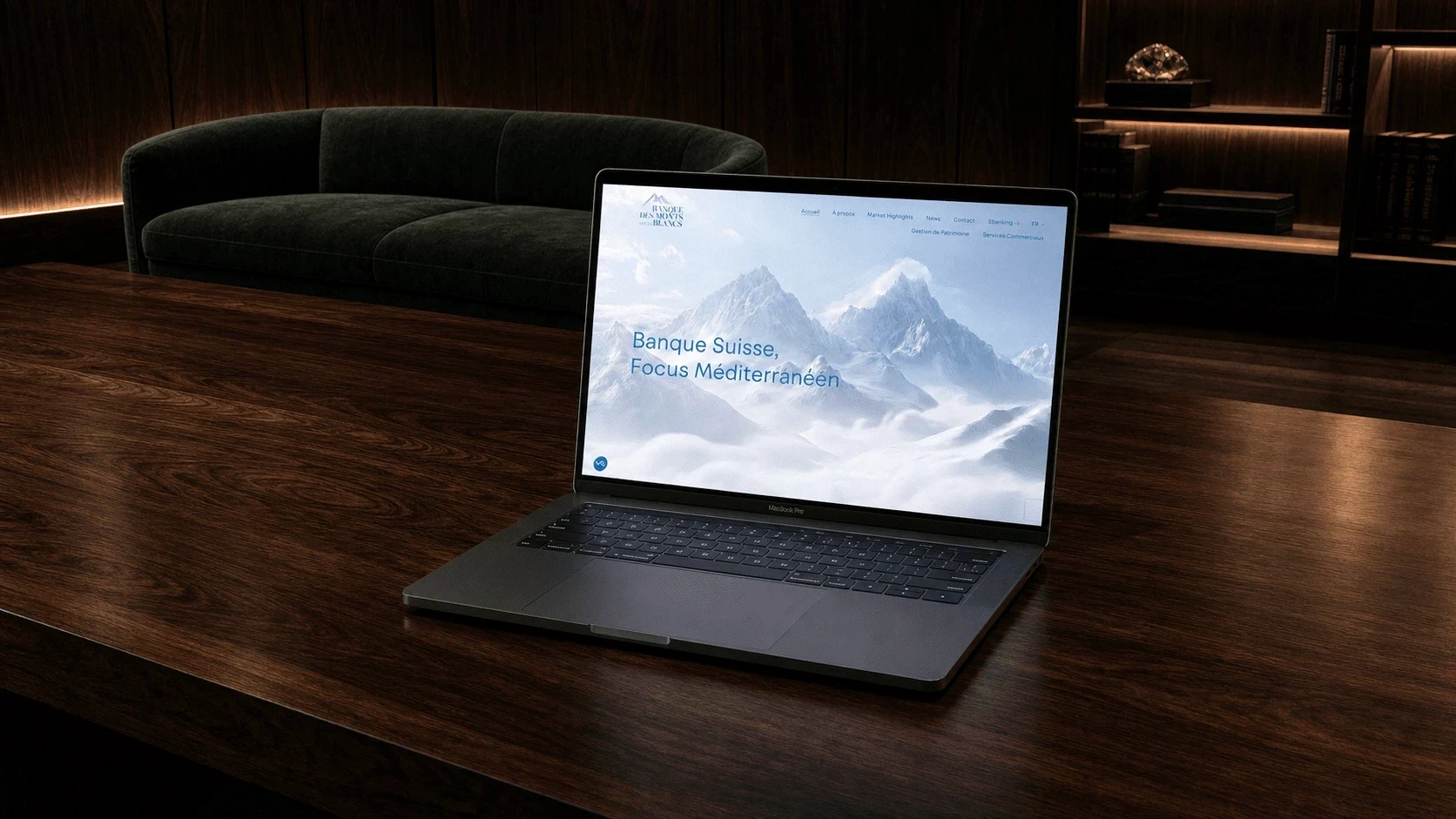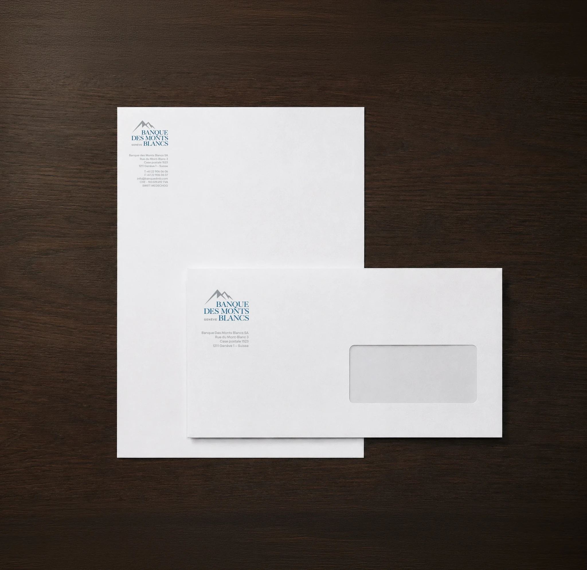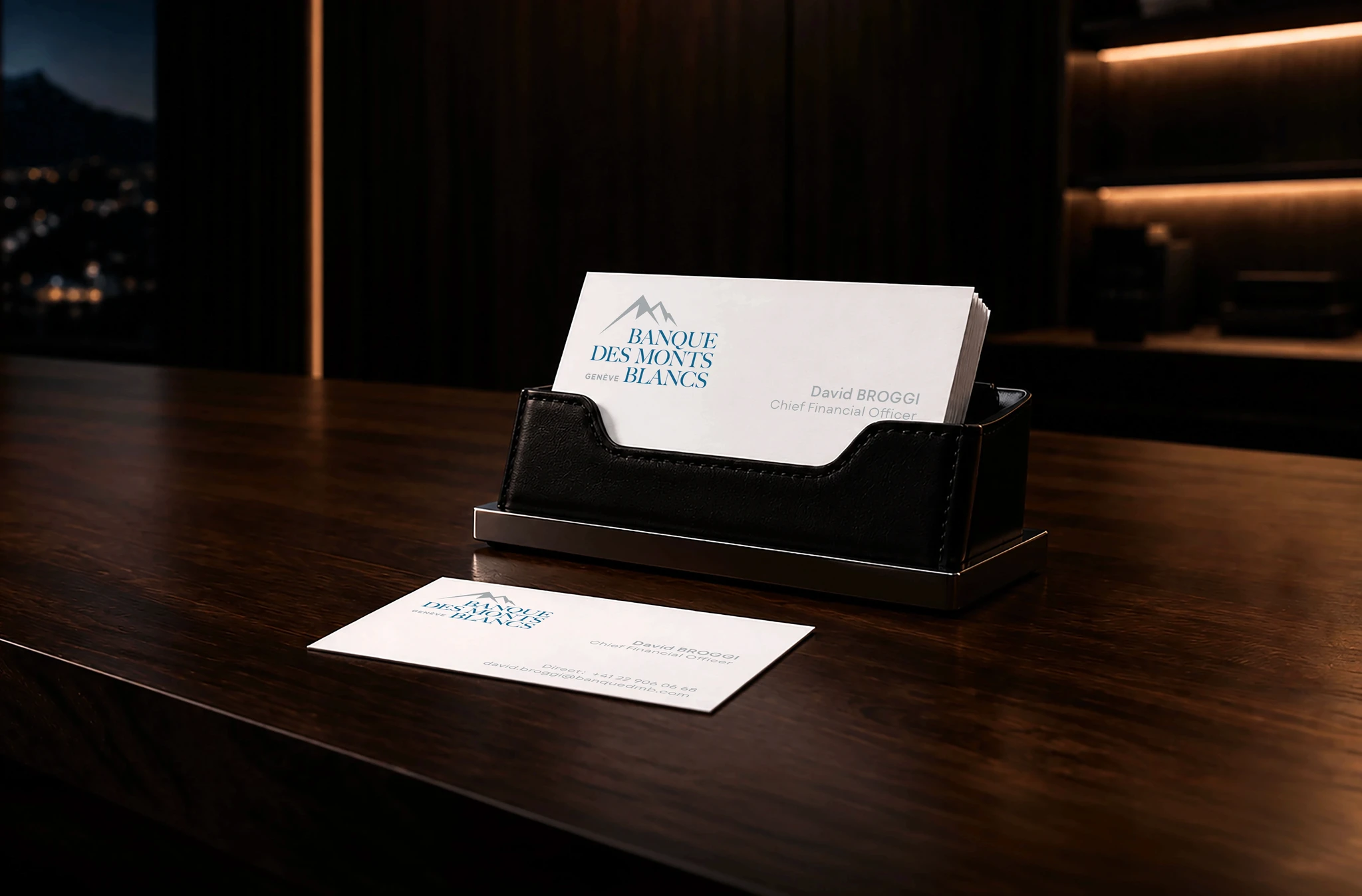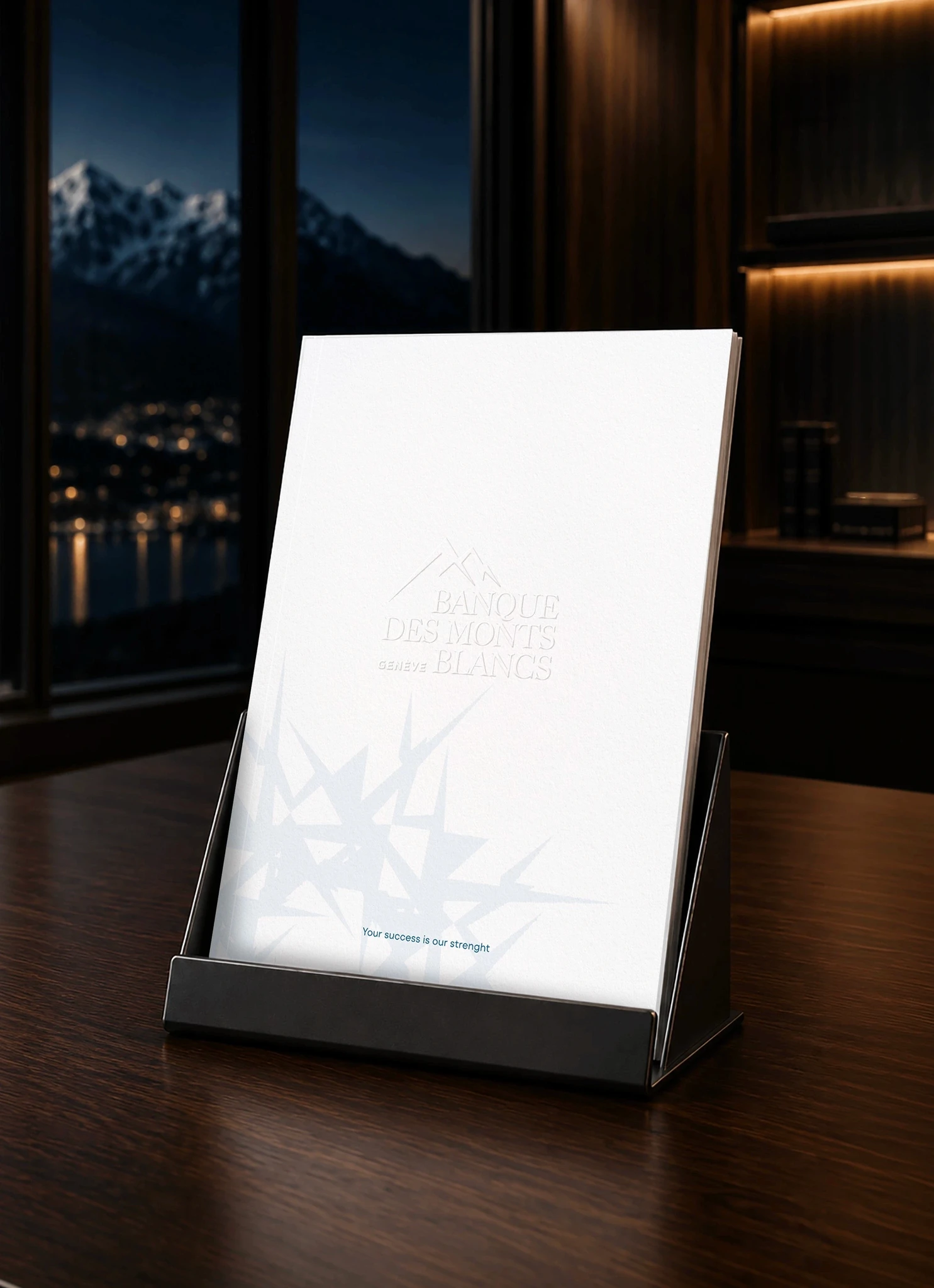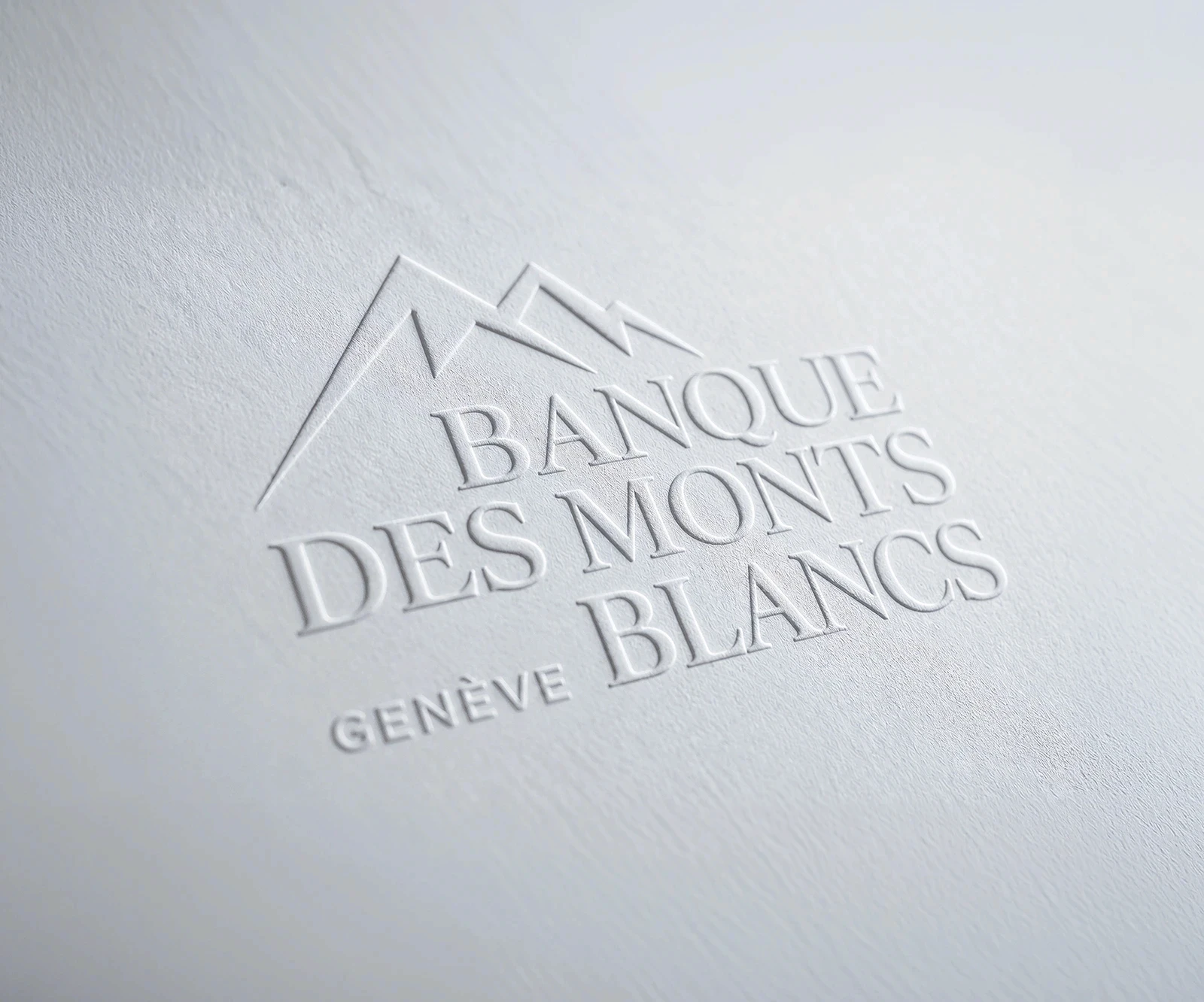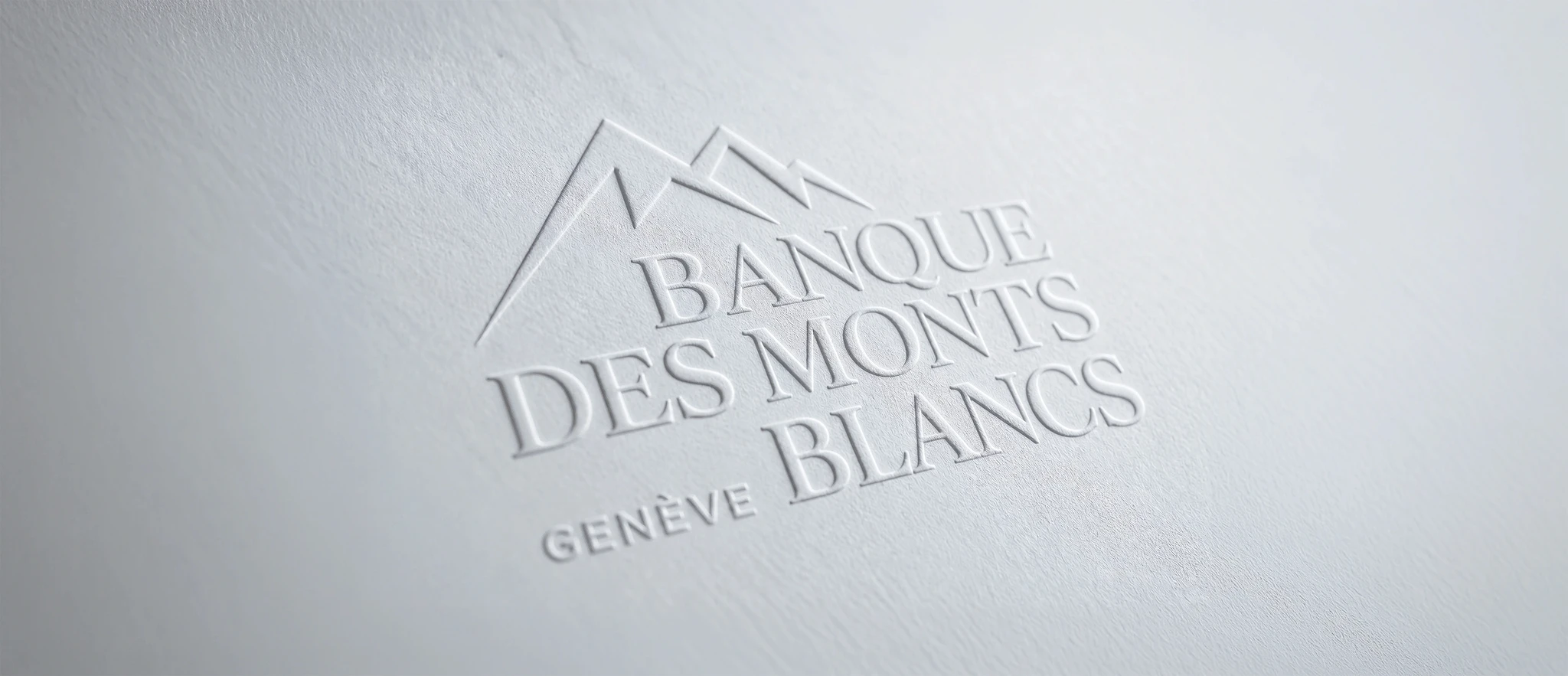
We supported Bankmed (Suisse) in its transformation through a complete rebranding process, working on both the naming and the entire visual identity. With this new name and renewed identity, the bank wanted to reaffirm its position within the Swiss banking sector while remaining true to its Mediterranean roots and values, which are central to its niche clientele. To preserve a connection with its historic and emotional relationship with Lebanon, we proposed an etymological approach: the name “Lebanon” comes from the Semitic root L-B-N, meaning “white.” Literally, Mount Lebanon was known since Aramaic times as “the white mountain.” As the bank’s clientele is spread across the Mediterranean basin, we felt it was appropriate to use the name in the plural: “les monts blancs.” This gave the identity an international dimension, while also echoing the Swiss peaks.
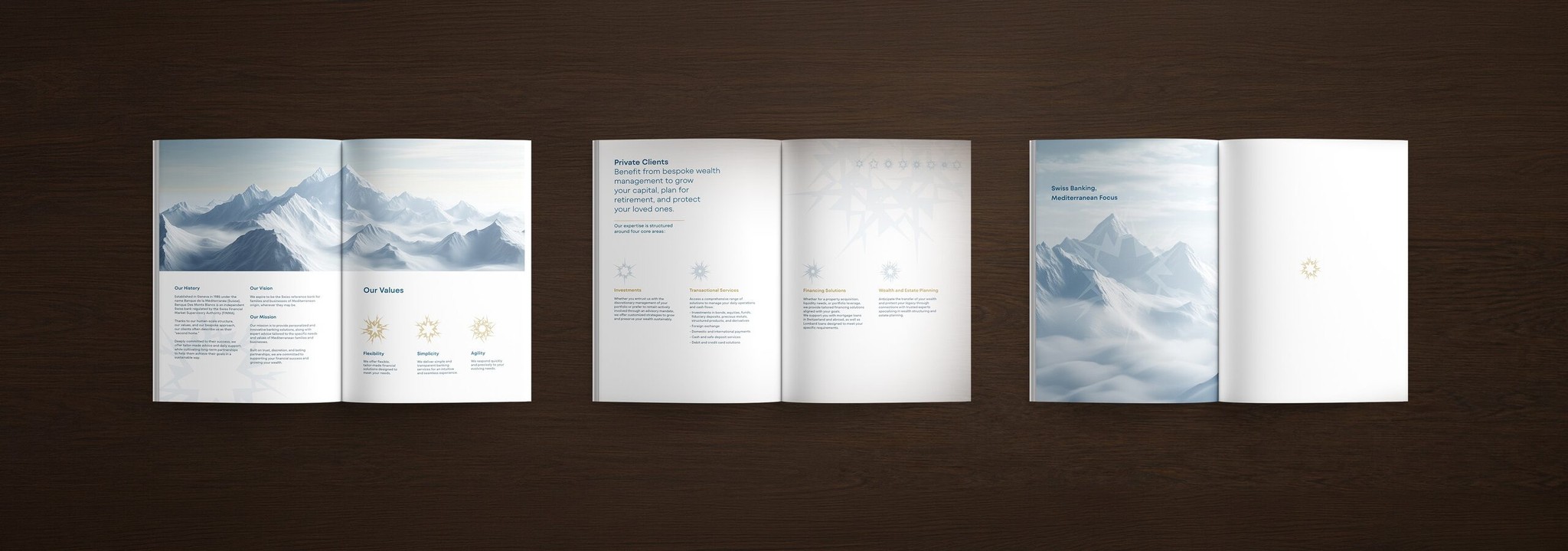
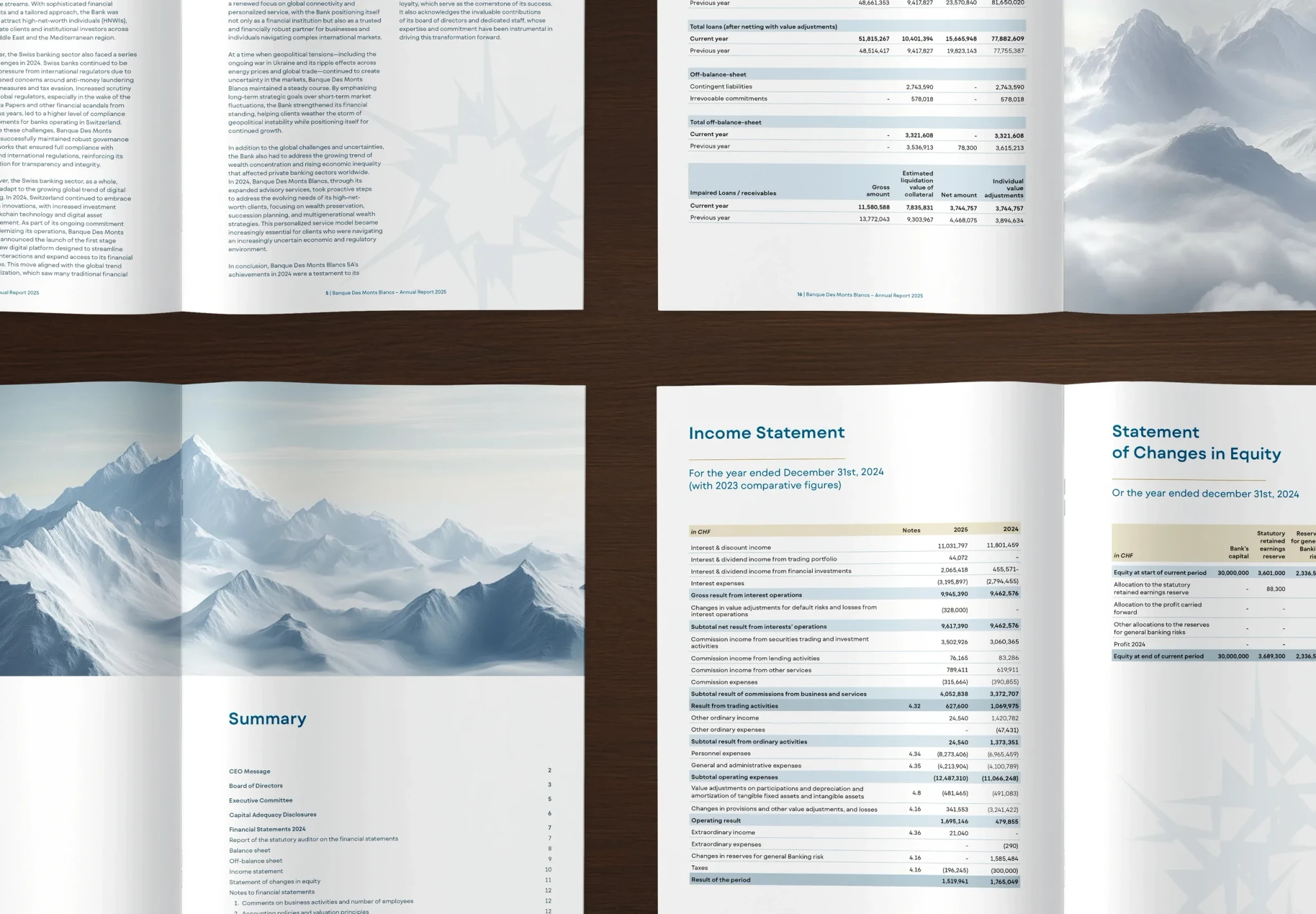
We developed an iconographic universe and graphic language inspired by the mountain: ethereal, refined, luminous and stable institutional imagery, combined with a series of snowflake pictograms composed solely from the logo icon. This visual world was rolled out across the website, signage, annual report, presentation materials and an institutional video, establishing a clear, elegant and immediately recognizable identity.